
In one of the first games of postseason baseball today—the real postseason, not the play-in games—a team with a logo that Hallmark Cards designed will take on a team that once played with a Disney-designed logo. It's the Royals against the Angels, and there's plenty more weird baseball logo history where that came from.
Last October, we looked at the logos and names of all the teams taking the playoff mound. What we found were the strange, charming, and deeply eccentric hijinks that seem to be unique to baseball—and, in fact, might be what makes it great. So this year, we decided to do it again.
A few notes: These logos are used with permission from Chris Creamer's excellent sports logo archive. We've included the most important redesigns of the primary logos and left out a few smaller iterations to make them easier to read. I've also pulled out my write-ups of postseason teams who made the cut last year (Cardinals, Tigers, Dodgers, A's, Pirates) from last year's post.
The Kansas City Royals
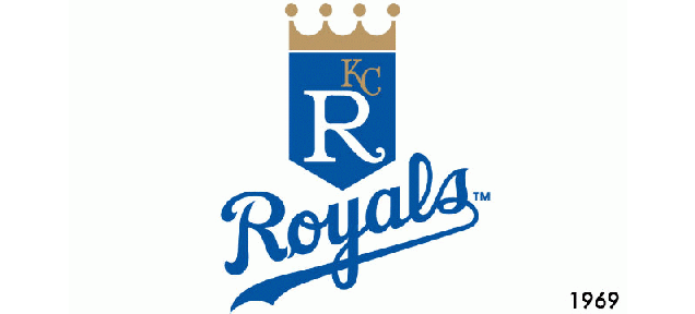
Nearly every MLB team has tinkered with its logo dozens of times. Except the Kansas City Royals. Unlike every other team on this list, KC has only changed its primary logo once—once!—in 45 years.
But there's actually a pretty interesting history behind that never-changing logo. You see, the card company Hallmark is based in Kansas City. When the Royals became a team in 1969 they needed a logo, and they turned to Hallmark. According to a fascinating story by Seamheads, the greeting card company actually opened up the job as a competition amongst employees (you can see some of the entries here).
The winner was a packaging designer named Shannon Manning, whose design has endured ever since. Apparently, Manning still had to fight for the integrity of his design: The bosses wanted the logo to incorporate "horse heads or cow heads" in the hole of the "R" as a nod to Kansas City's livestock prowess, Manning told Seamheads. Thankfully, the logo remained bovine-free.
The San Francisco Giants
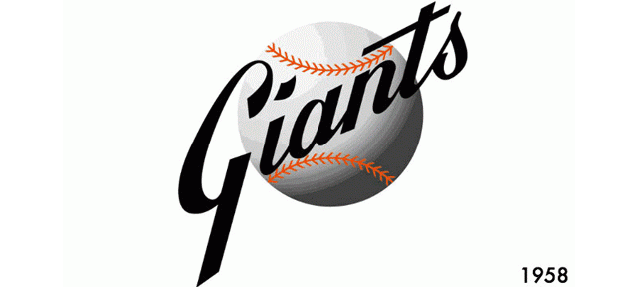
Like a number of other teams in the MLB, the Giants actually started out as an East Coast team: The New York Gothams. They gained their current name in a bit of folklore: According to legend, team founder Jim Mutrie was so moved by a win that he exclaimed My big fellows! My Giants! We are the People! And the name stuck.
Or so the theory goes. In fact, this story has been debunked, or at least called into question, in an excellent post by the LA Times' Brian Cronin, who discovered that the nickname had been in use before Mutrie shouted it. Still, it's a fun old story—and it certainly stuck. The logo designed when they moved to San Francisco in 1958 hasn't changed much at all.
The Washington Nationals
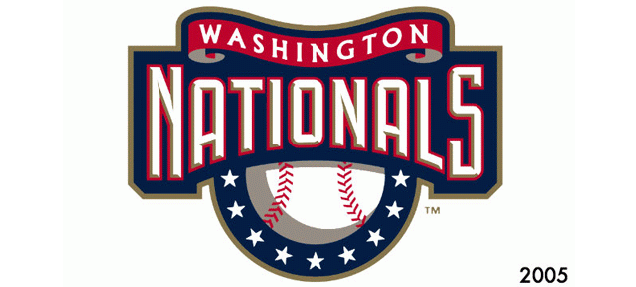
When the Montreal Expos moved to DC in 2005, there was a period of discussion about the team's new name—should they be the Nationals? The Grays, after the legendary African American team that once played in DC? Perhaps the Senators? The fury at the latter was palpable in the District—which, of course, has no senators (a sore spot!). "We have 100 senators, and not one represents me," wrote Barry Svrluga in an op-ed at the time. "I didn't vote for any of them."
In fact, nearly everything about the Nationals was controversial in DC. The team began operations at the height of the Iraq war, and its cap logo, a swooping W, reminded almost everyone of the president who was leading it. Some loved that, others hated it—but plenty of hats with alternate, Dubya-free logos were sold.
The Los Angeles Angels of Anaheim
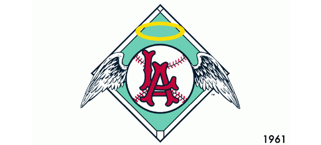
How the hell do the Angels exist in two cities at once? The short answer is: Money (it usually is!). Originally, the team was known as the Los Angeles Angels. In 1965, it changed its name to the California Angels because it was moving to a new stadium in Anaheim. 30 years passed, and the stadium was in tatters—until Disney, which was about to take control of the team, stepped in to renovate it. The city of Anaheim helped, and in return, it stipulated that the team's name contain Anaheim. Still with me? In 2005, a new owner decided to tack Los Angeles back onto the team's name. Which would be fine, except they were now legally required to include Anaheim, too. Finally, last year, a new lease meant that they could drop Anaheim.
The logo follows this progression: From a winged "LA" logomark to an outline of California to a universally-ridiculed baseball bat with wings designed by Disney. Now, they've got a stoic A with a halo. The moral of this story: There's no such thing as a free stadium renovation.
Baltimore Orioles
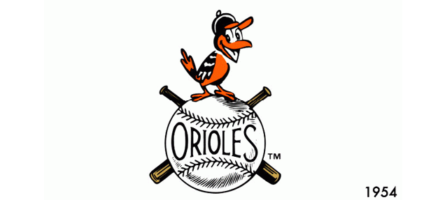
Though most people might not realize it, the Orioles started off life as the St. Louis Browns—in fact, they spent more than half a century there. But when they moved to Baltimore after World War II, the team started fresh: New city, new name, even new players. Ironically, when they got to Baltimore, they took up a name—the Orioles—that had been around for even longer. The original Orioles had moved to New York in the early 1900s and, eventually, became the Yankees.
So, what about the bird? Well, there's a fairly simple answer: The Oriole is Maryland's state bird. Over the years, the logo has morphed from a very Disney-esque cartoon bird into something that looks a little more anatomically correct—a bit like the Pirates' transformation from gawky cartoon character to steely-jawed realistic pirate guy, below.
LA Dodgers
The Dodgers' name and logo have nothing to do with dodging balls (or LA cars). In fact, they're a reference to a diss that New Yorkers would often aim at Brooklynites in the 1890s. Manhattanites often referred to their eastern neighbors as "trolly dodgers" because Brooklyn was covered in street-level trolly tracks.
But the pejorative nickname wasn't officially adopted for more than 40 years—mainly because, until the 1940s, newspaper writers and fans used all sorts of nicknames for their favorite teams. It was definitely different than today's highly-regulated branding schemes, that's for sure. And when the team moved to LA in 1958, the in-joke stopped being a joke and became a way to shed the "B" of the Dodger's traditional logo.
Detroit Tigers
The Tigers were an original charter team in 1894, and they borrowed their name from a local group of legendary war heroes—the Detroit Light Guard. Formed in response to Abraham Lincoln's declaration of war, the Light Guard (nickname: the tigers) went on to become heroes in Michigan. The members of the legendary fighting squad would have been in their 70s when Detroit's baseball team was chartered, so the name was a natural nod to a local tradition. According to A Place for Summer: A Narrative History of Tiger Stadium, the team even petitioned the group for permission to use their logo.
So Detroit's titular Tiger isn't just another random animal mascot—it's a nod to Detroit's Civil War heroes.
St. Louis Cardinals
The Cardinals are actually one of the earliest examples of a strategic rebranding. Originally known as the Brown Stockings, the team changed hands a number of times in the 1870s and 80s, leading the two men who eventually took control in 1898 to overhaul the team's look. The new owners—two brothers by the names of Frank and Stanley Robison—decided it was time to switch things up. And because the team had recently worn red stockings, they chose the Cardinals as a name (legend goes that a lady observer remarked that their uniforms were a "lovely shade of cardinal").
But the Cardinals easily could been the Spiders. When they fell into the hands of the Robinsons, the brothers also owned the Cleveland Spiders. Rather than consolidate the Browns and the Spiders, they cherry-picked players from Cleveland and renamed St. Louis as the Cardinals. But if you want, you could still root for the St. Louis Brown Spiders tonight and be, technically, sort of correct.
Oakland A's
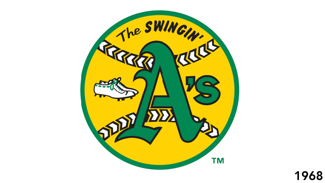
The A's were a Philadelphia team for 50 years—see: their beef with Pittsburgh above. And the name "Athletics" dates back even further, to before the leagues we know today, when baseball teams were more loosely organized around "athletic clubs." The A's have stuck with the tradition, but they've also attempted some forward-thinking updates. For example, the short-lived name change you see in 1968, above. "The Swingin' A's?" Yep—that was someone's idea of a disco/baseball pun.
Pittsburgh Pirates
Since they hail from a city situated on three rivers, you'd think that the Pirates' name is somehow related. But no: In fact, it hails from a scandal perpetrated in 1890. The team—then roughly 15 years old, having gone through a multitude of reshufflings and renamings—was scouting a player named Lou Bierbauer who had played for the Philadelphia Athletics.
Bierbauer was due to return to Philly after a disastrous season in Pittsburgh, but according to Philly's managers, Bierbauer was accidentally left off of their roster. The Pittsburgh team (then known as the Alleghenys) snatched him up anyways. And in a letter condemning their actions, a league official called the team's act "piratical." Pittsburgh embraced it.
from Gizmodo http://gizmodo.com/the-hidden-history-of-this-years-mlb-playoff-team-logos-1641410450
No comments:
Post a Comment